I recently gave a presentation on graph visualization. Visualizing graph data is an important area of study because good visualizations can reveal patterns and insights, and confirm or falsify hypotheses. It turns out there is even an annual conference dedicated solely to the advancement of graph visualization. Without graph visualizations, it would be impossible to gain the same insights if one were just looking at the raw data in a table format. A good visualization of the data should at least try to be readable, usable, and aesthetically appealing. But creating a good visualization of graph data is a non-trivial challenge. In order to create a good visualization, we need theory and a set of principles or heuristics about what constitutes a good visualization.
Let’s take a step back and define graphs and visualizations. A graph is a collection of nodes (also called vertices) with relationships between them called edges. A graph can be represented by an adjacency matrix or an adjacency list and can be directed or undirected. A directed graph is a graph where edges have a direction and are often visualized by showing lines with arrows.
A visualization of a graph is a collection of points within a Cartesian coordinate space representing nodes, and lines between those points representing the edges of the graph. Sometimes these visualizations are also called “graphs” or “graph drawings.”
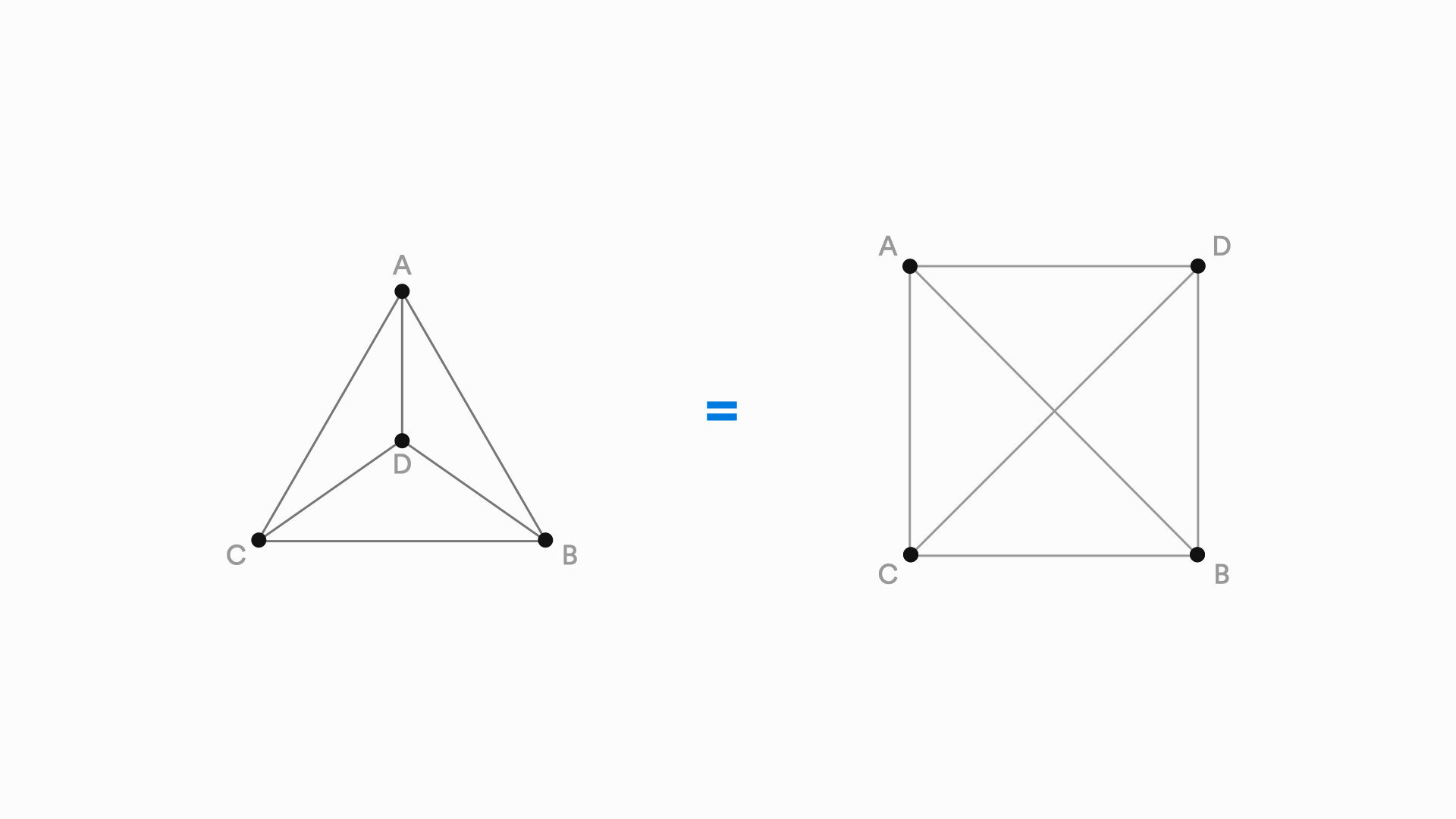
And, for every graph, there are multiple ways that graph could be visualized.
Visualizations of graphs can be created manually or algorithmically. If the graph has a small number of nodes, visualizations can be created manually in a program like Adobe Illustrator or Omnigraffle. Graphs that have more than a handful of nodes and edges require algorithms to generate visualizations. Manually generated visualizations are tedious to create, but the designer has full control over how to present the visualization. Current algorithmic methods quickly produce visualizations, but sacrifice control and aesthetic quality. To get a bit technical here, there are four different approaches to generating graph visualizations—force-directed layouts, dimension-reduction based layouts, computational improvements like multi-level techniques, and machine learning approaches which are relatively new.
Principles and heuristics for graph visualization aesthetics should be grounded in principles of human perception and cognition. Two theoretical frameworks that are relevant to graph visualization include Don Norman's emotional design framework and Gestalt Theory.
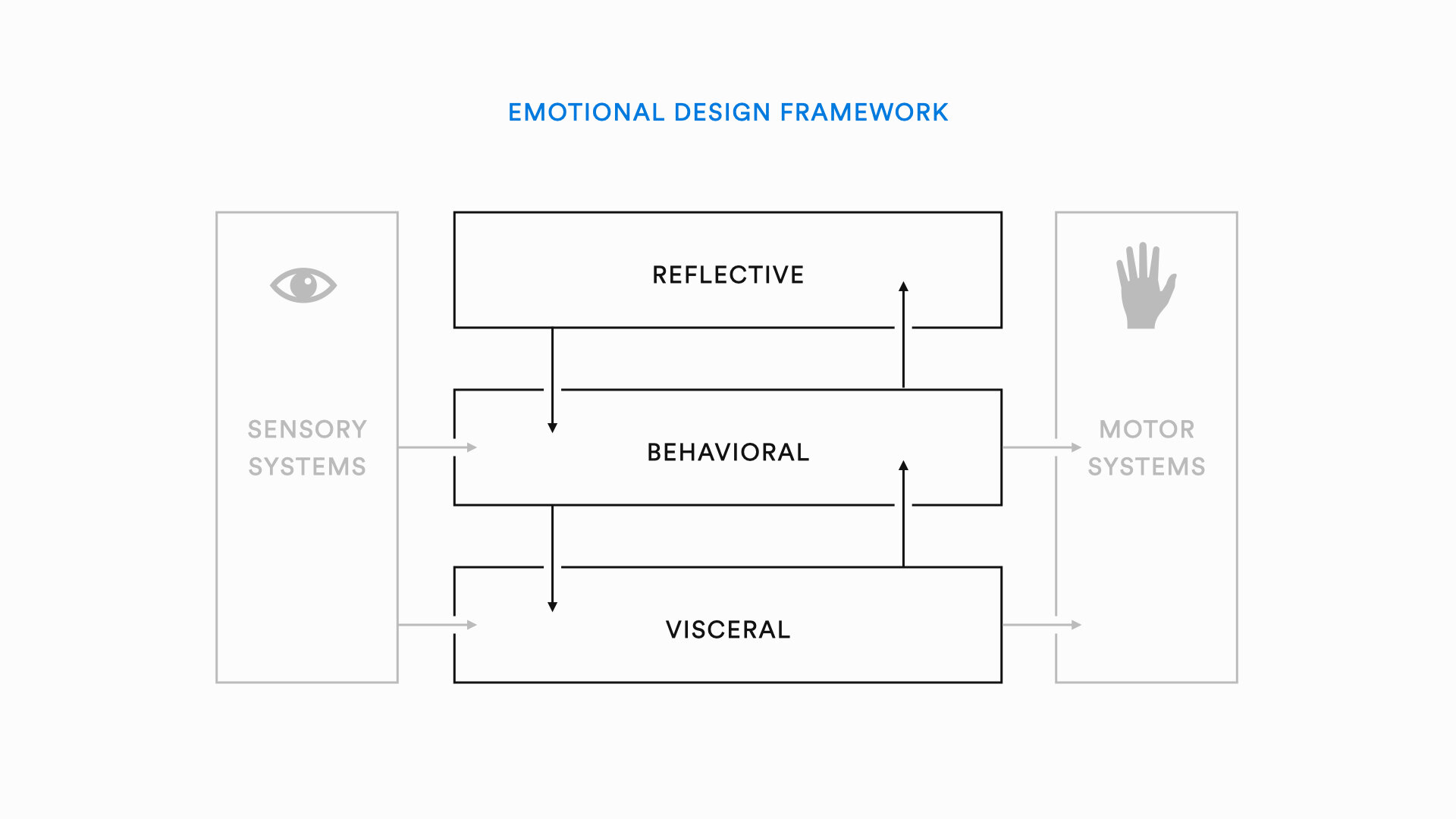
The emotional design framework describes 3 levels of emotional processing that occur when we interact with design artifacts. The 3 levels are the visceral, behavioral, and the reflective level. The visceral level is the most basic level of emotional processing. It is fast and automatic. In terms of visual design, the visceral level relates to our immediate perceptions as well as the attractiveness of an artifact. The behavioral level occurs at the level of most human behavior and is the result of perceptual organization. The behavioral level focuses on how usable, or functional a design artifact is. The reflective level is slow and deliberate, relates to meaning, deeper understanding, and prompts memory and imagination.
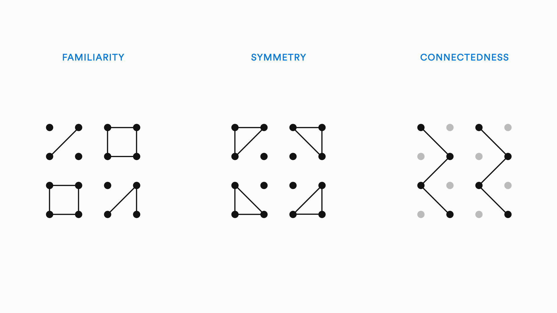
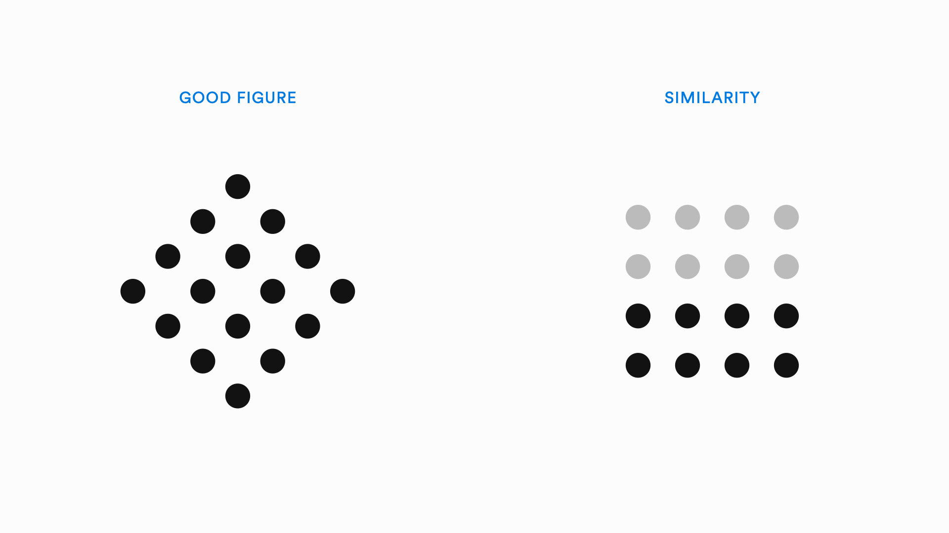
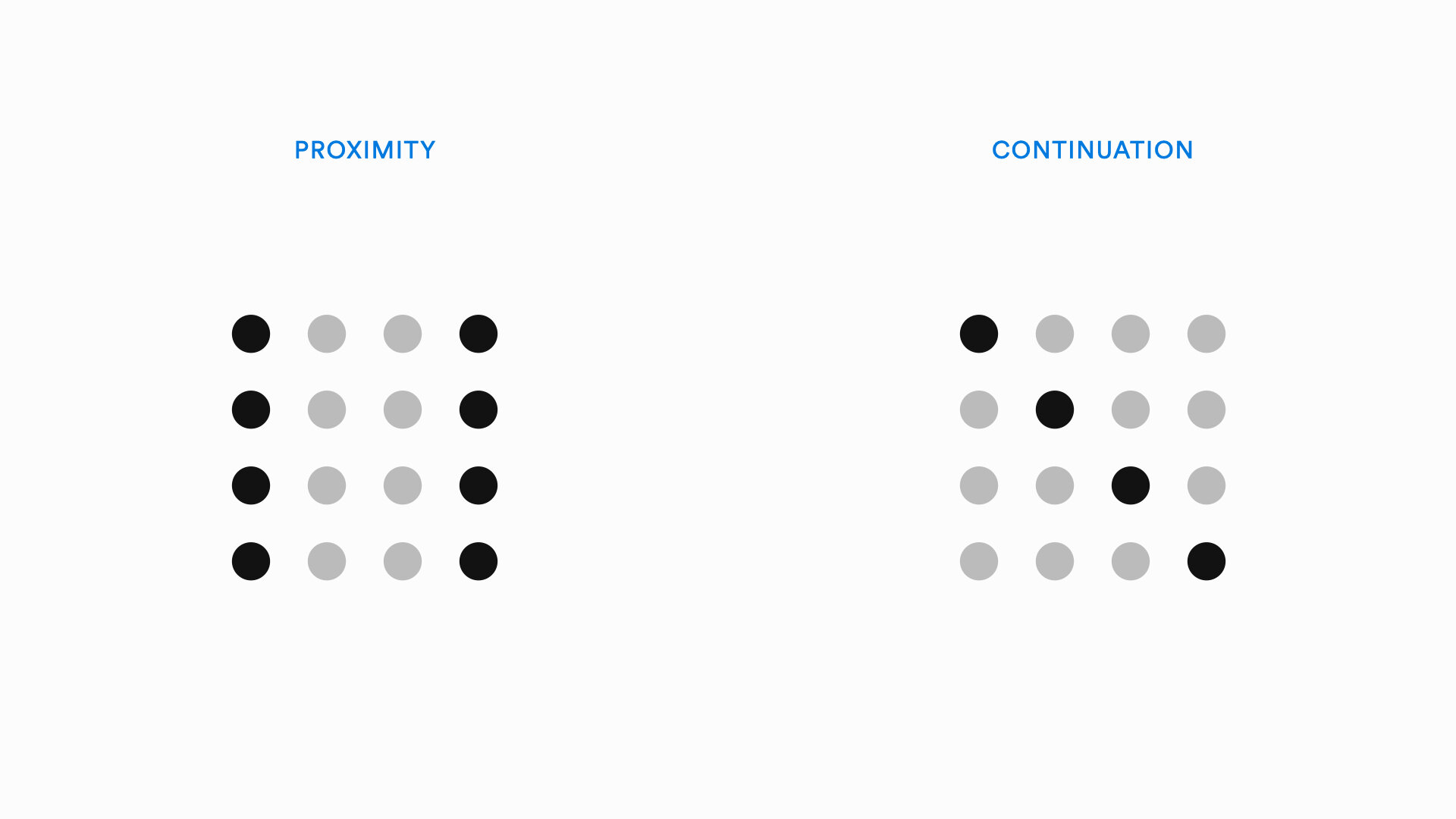
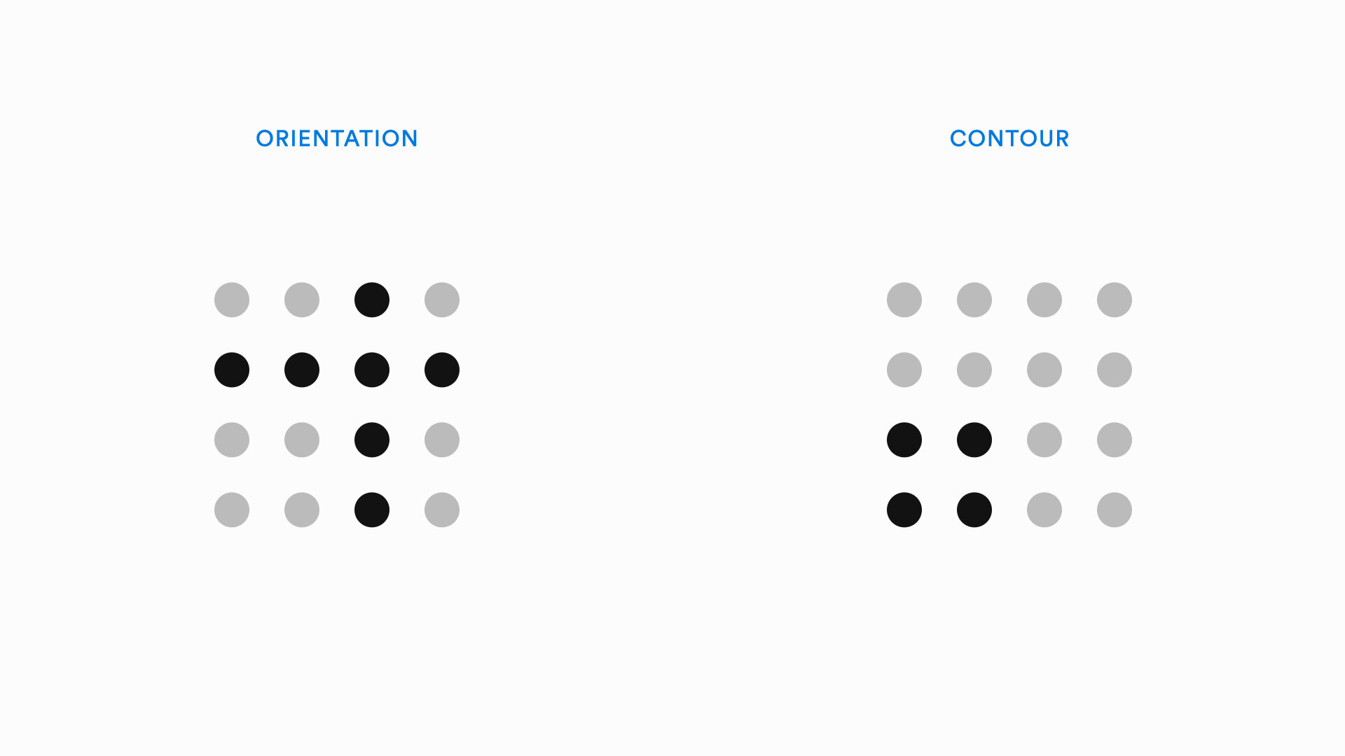
Gestalt Theory is a set of principles that describe automatic perceptual processing. These principles map onto the visceral level of emotional processing. A few principles of Gestalt Theory are shown below:
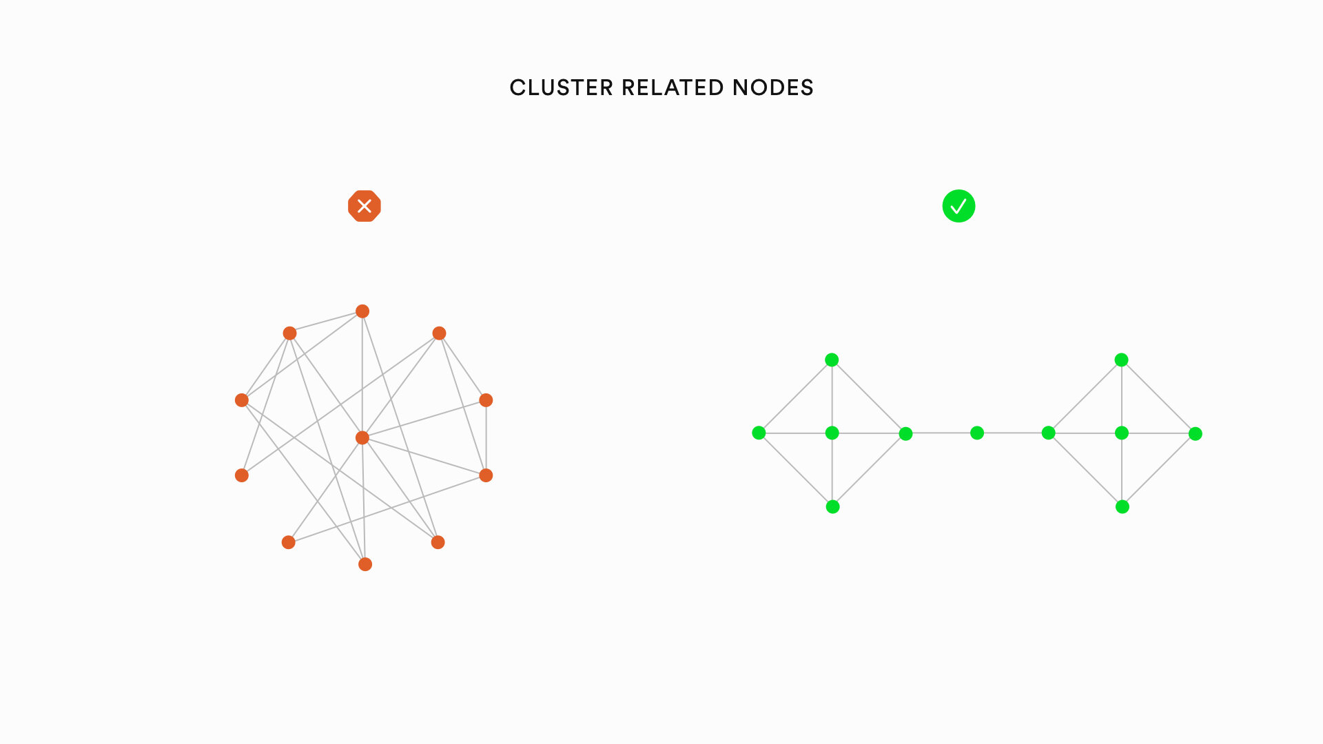
Gestalt principles provide a foundation for specific graph visualization heuristics. For instance, the principles of proximity and connectedness lead to the heuristic that nodes with many shared edges between them (technically called a cluster) should be visually grouped together to convey an appropriate sense of their organization. Similarly, the principles of familiarity and symmetry lead to the heuristic that similarly organized clusters of nodes should share a similar visual appearance within the larger visualization.
The principles that are most relevant to graph drawing are:
Continuity: Nodes that are plotted in a continuous pattern are grouped together
Proximity: Nodes that are close to each other are grouped together
Connectedness: Nodes that are connected to each other are grouped together
Familiarity: Similar arrangements of nodes are grouped together
Symmetry: Nodes displayed in a symmetrical pattern are seen as different from other nodes
Orientation: Nodes oriented in a horizontal or vertical pattern are seen as different from other nodes
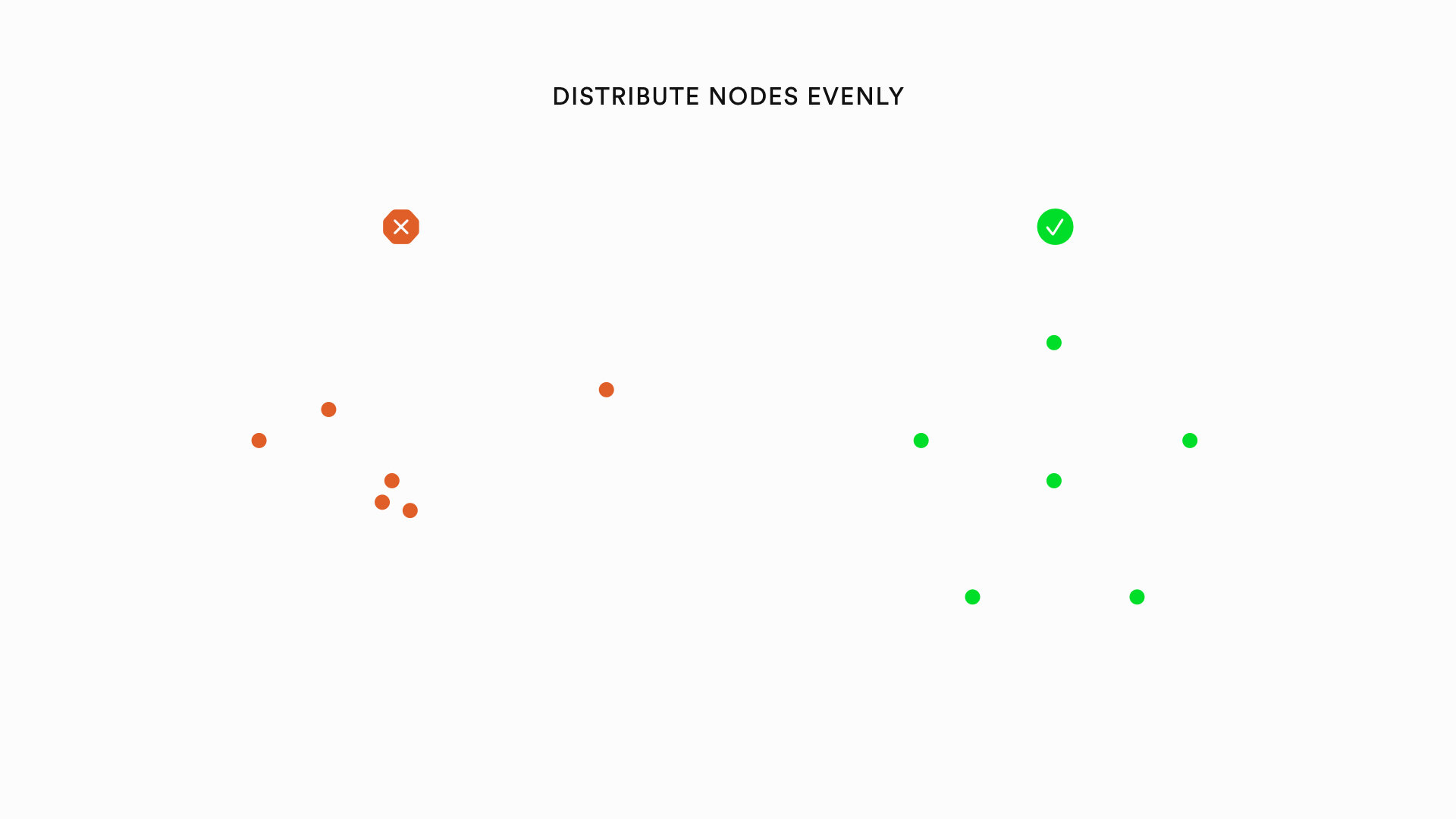
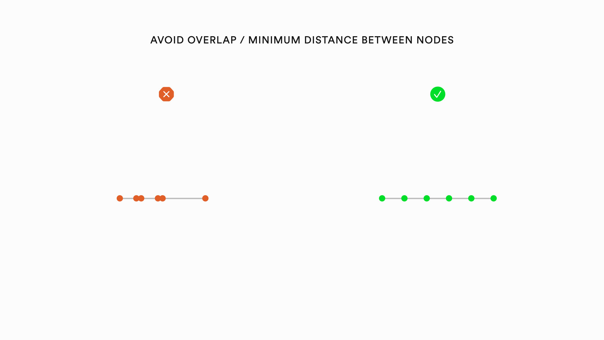
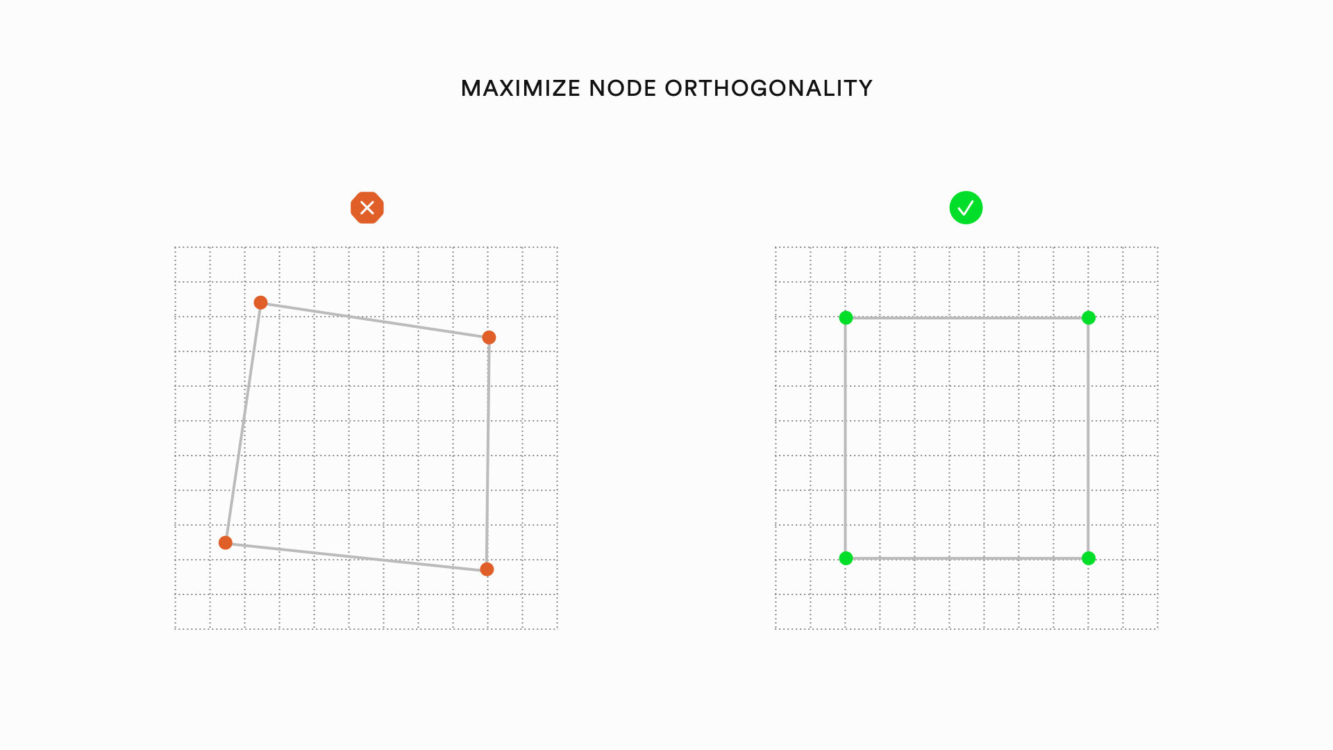
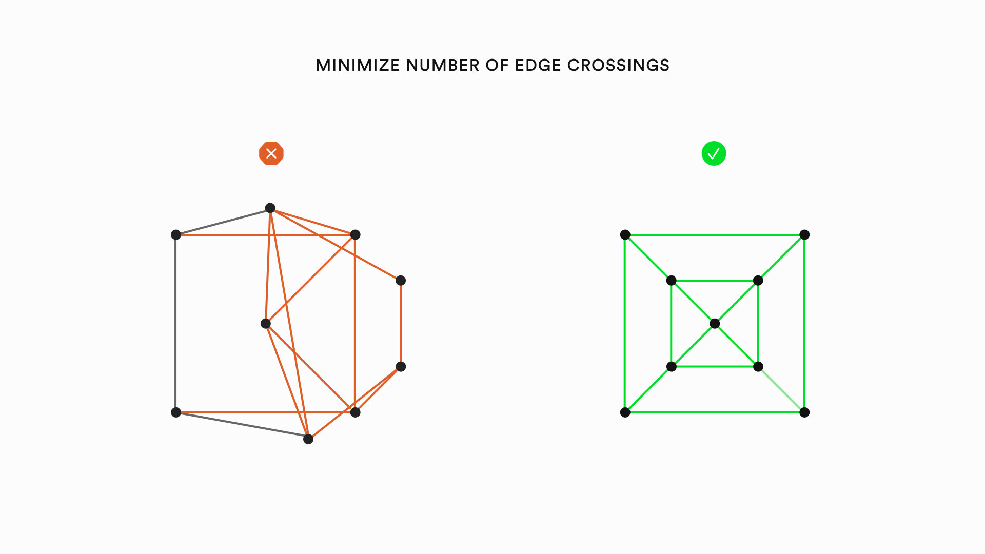
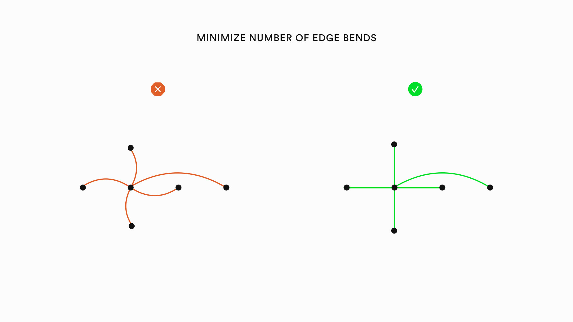
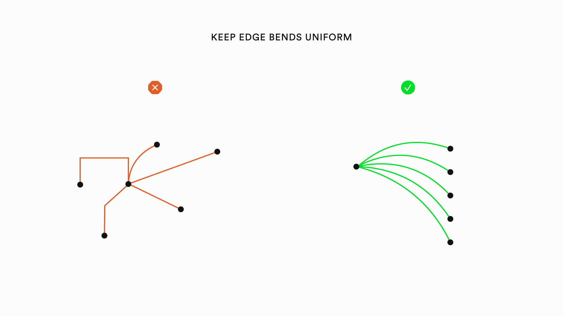
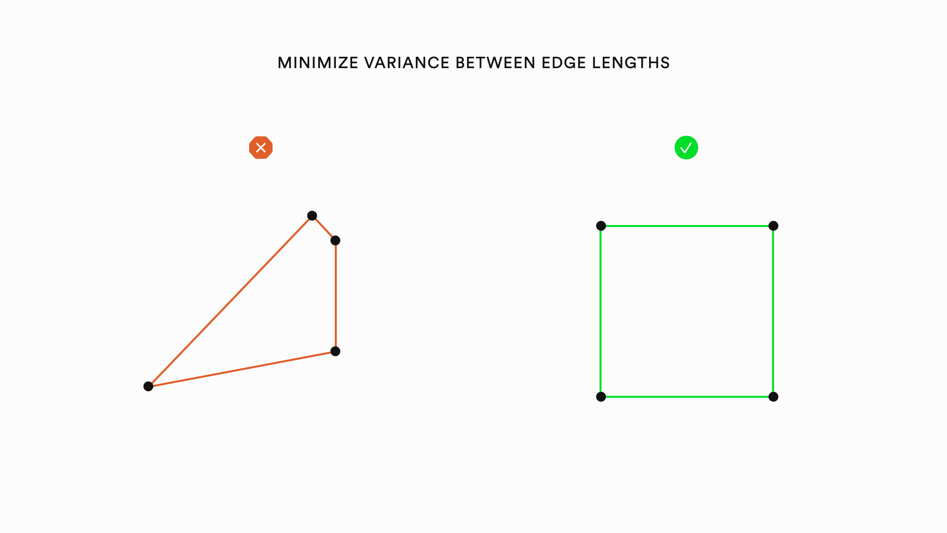
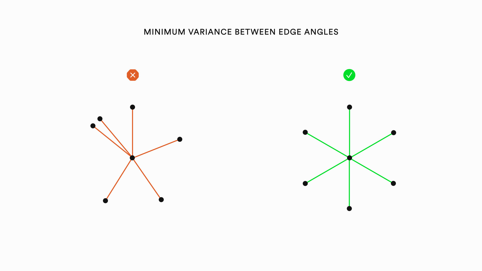
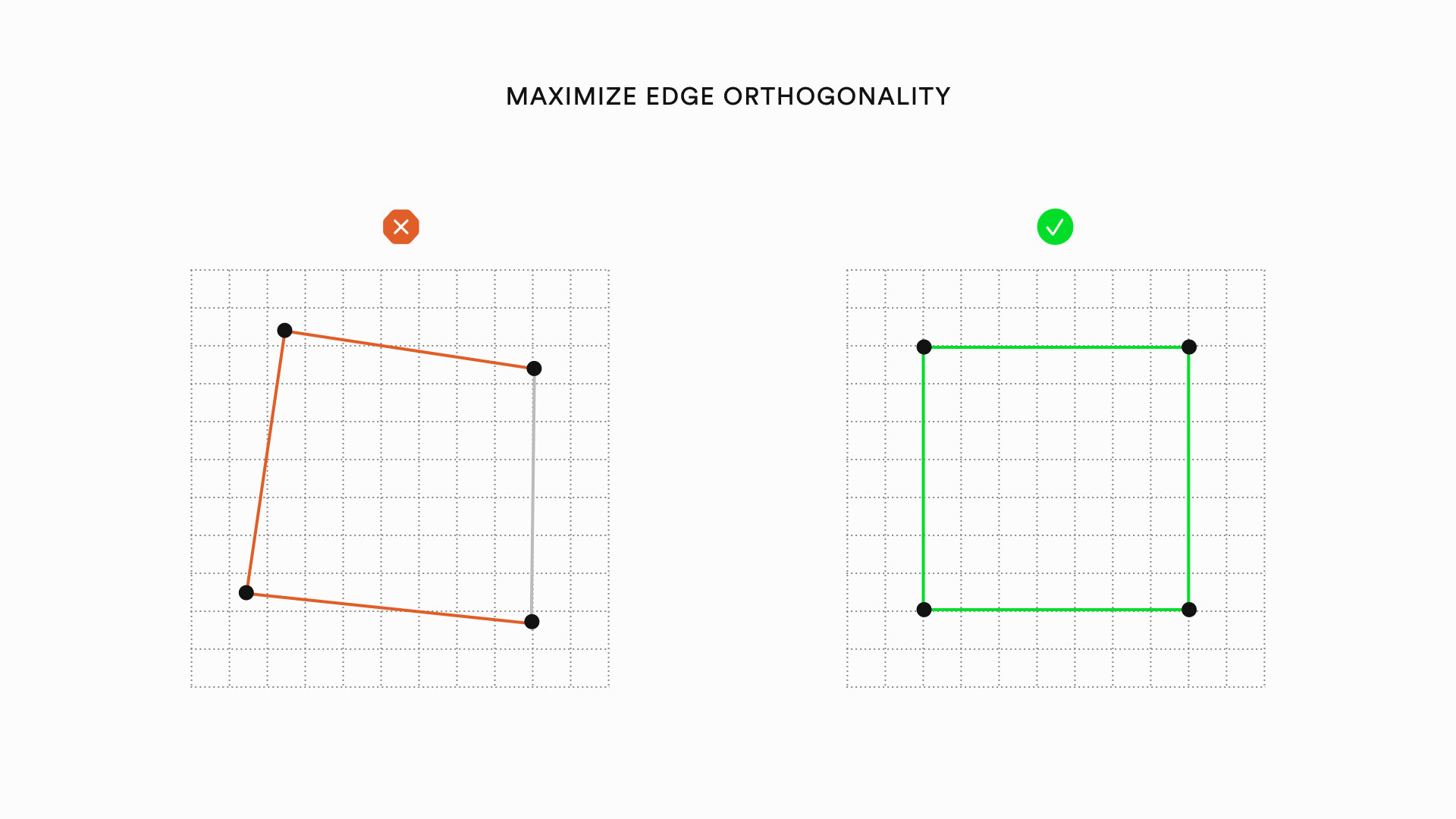
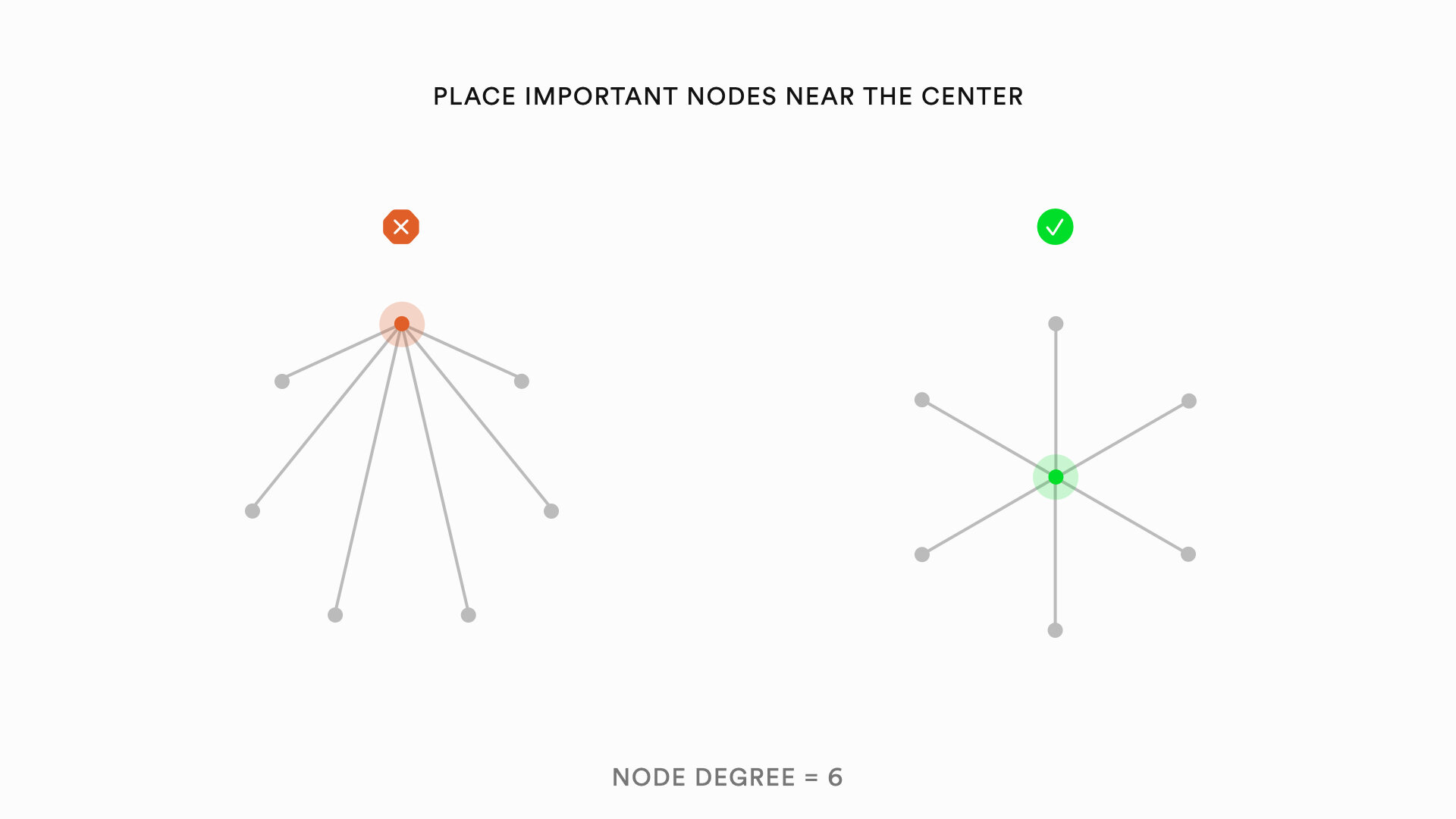
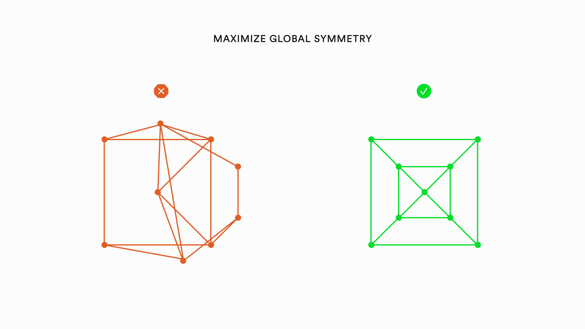
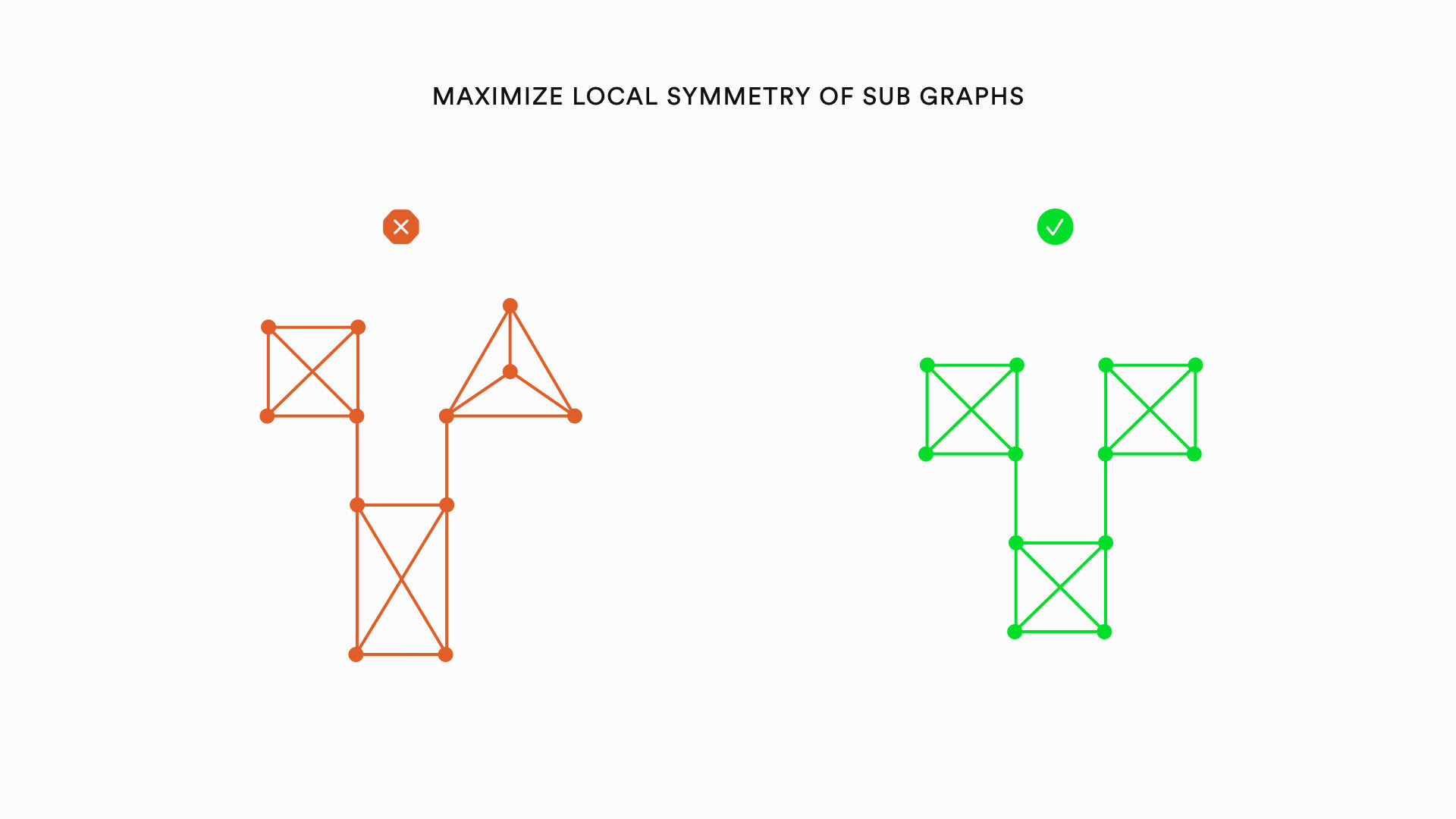
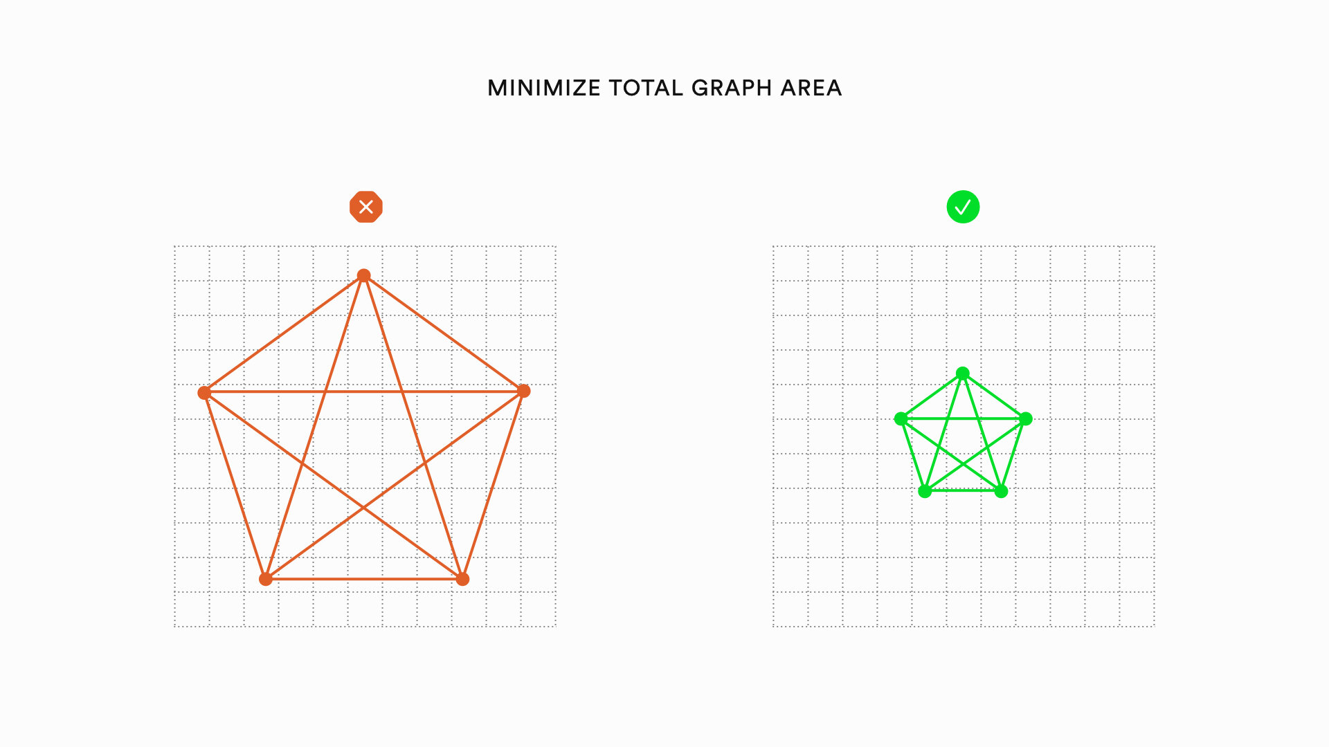
Graph visualizations can be improved by heuristics relating to the nodes of a graph, the edges of a graph, and the overall layout of a graph. The following is a list of specific heuristics that can improve the aesthetics of graphs:
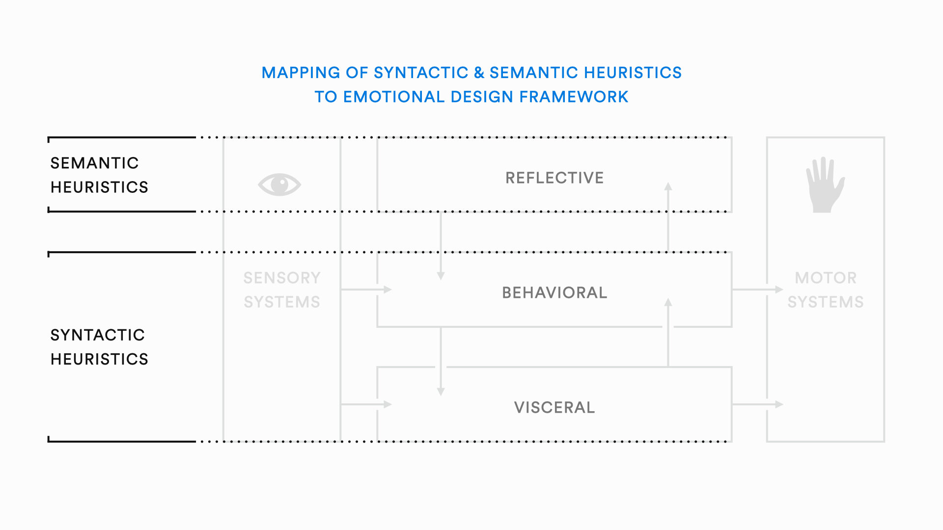
Heuristics for drawing quality graph visualizations can also be categorized into syntactic and semantic heuristics. Syntactic heuristics relate to the general organization and readability of a visualization. Semantic heuristics refer to heuristics designed to convey deeper meanings contained in the graph structure. Syntactic heuristics map onto Norman's visceral and behavioral levels of emotional processing. Semantic heuristics map onto the reflective level. Most research on graph visualization is focused on the syntactic heuristics because addressing semantic meaning is much more challenging.
Applying these heuristics to graph drawing is challenging for several reasons. First, when trying to apply the above heuristics to graph drawing, there are inevitable trade-offs. Consider the following example:
One of the most important heuristics is to avoid edge crossings. The visualization on the left follows this heuristic, but the visualization on the right is better. The global symmetry and local symmetry make it much easier to read. Most cases of trade-offs are not so clear. Another challenge with graph visualization comes with using algorithmic methods. Ensuring that there is a minimum number of edge crossings, for example, is what is called an NP-Hard problem in computer science. Basically, this just means that as a graph gets bigger, the problem gets really difficult, really fast such that it would take so long to process that it wouldn’t be worth it to wait. This means that many graph visualization heuristics can only practically be applied to graphs with a relatively small number of nodes.
In conclusion, the emotional design framework and Gestalt Theory form a collection of concepts that provide a foundation for principles and heuristics for graph visualization. Understanding these concepts can help us design graph visualizations and graph drawing algorithms to understand complex phenomena such as social networks and produce better visualizations of data. I recently worked on a project that tried to algorithmically evaluate graph visualizations to improve their quality. More generally understanding these foundational principles and heuristics can apply to a wide variety of problems in graphic design and industrial design.
To learn more check out:
The Aesthetics of Graph Visualization
Emotional Design by Don Norman
Survey of Graph Drawing
